
Did you know that around 40% of all accessibility issues could be identified as early as the design phase?
That’s a striking figure, and one that highlights just how crucial the design stage is in the creation of accessible digital products. Yet accessibility is too often left to be addressed during development or even later – when it may already be too late or too costly to fix easily.
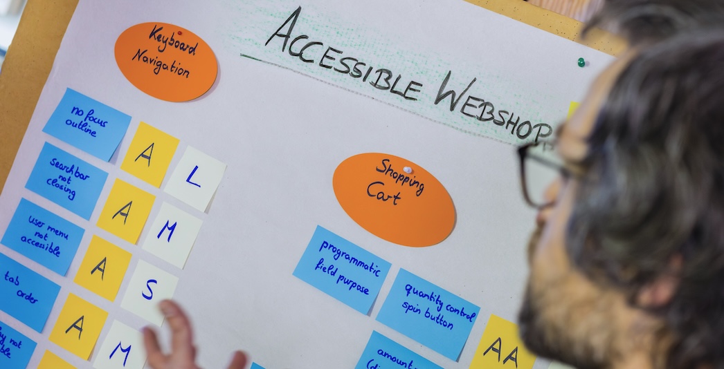
At Spaceteams, although we don’t produce visual designs ourselves, we work closely with designers from both internal teams and external agencies. Our engineering teams are trained in accessibility best practices and we regularly review design drafts with accessibility in mind. Through our experience, we’ve realised that having an overview about reoccurring issues helps us to consistently flag potential issues early on, before they become costly technical debt.
This article shares our insights, based on the Web Content Accessibility Guidelines (WCAG) and the W3C-Tipps für barrierefreies Webdesign, enriched with practical learnings from our own work.
Note: This overview is not a complete or absolute guarantee of accessibility compliance, but a guide to help teams spot common issues early in the design process.
Why accessibility starts with design
Before we dive into the list, it’s worth reiterating why design plays such a crucial role in accessibility:
- Design choices dictate usability: Colours, font choices, interactive elements – all these define how people interact with your product.
- Preventing issues early saves time and money: Identifying accessibility flaws during the design phase helps avoid complex fixes later in implementation. Beyond the higher costs, late changes often lead to unnecessary back-and-forth between design and development teams in search of a compromise.
- Inclusive design supports everyone: Accessibility improves usability for people with disabilities, but also benefits all users in different contexts (e.g. bright sunlight, slow connections, small screens).
Let’s now look at the specific areas we assess when reviewing designs.
The Obvious: Colours, Fonts and Contrasts
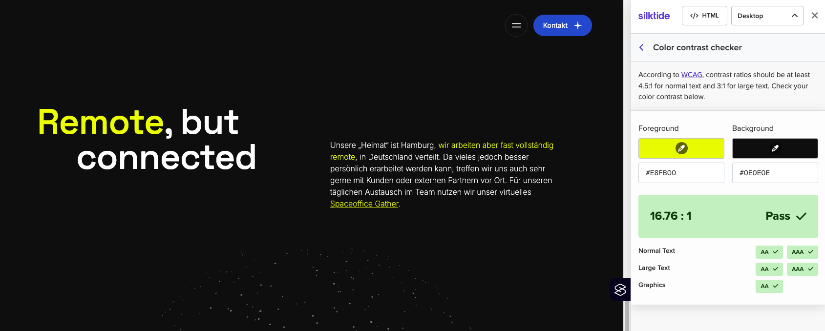
When people think of accessibility, colours and contrast often come to mind first, with good reason. These elements are comparatively easy to check with your own eyes or with tools (such as the WebAIM Contrast Checker):
- The contrast between foreground (usually text, buttons or similar elements) and background needs to be at least 4.5:1. For large-scale text (18 pt+ or 14 pt+ bold) the required ratio is 3:1.
- Besides this, there are some colour combinations, like red and green, which are hard to distinguish for users with colour-vision deficiencies. A lot of tools, e.g. Silktide-Browser-Plugin, simulate these impairments to help spot potential issues.
- Another crucial consideration when working with colours is to never rely on colour alone to convey meaning. For example, indicating a status change from red to green, since this may not be perceivable for people with colour-vision deficiencies. Adding an icon or an explanatory text helps.
- While WCAG does not prescribe a minimum font size, best practices suggest at least 14 pt for body text and at least 18 pt for headings.
- We recommend choosing clear, legible fonts with distinguishable letterforms and sufficient spacing. Even though sans-serif fonts are not required, they are often a good choice because of their simplicity.
Look from the top: Headings and Heading Structure
While it may not be considered a traditional visual design element, heading structure and overall page navigation are critical components that should be addressed during the design phase – not as an afterthought.
Beyond assistive technology, a well-organized heading system benefits SEO, improves scannability for sighted users, and reduces cognitive load:
- Choose one main headline (h1) that defines the main topic or purpose of the page.
- Use subheadings in a meaningful order (h2 under h1, h3 under h2, and so on) and don’t skip levels. Avoid jumping from an h2 to an h4 unless the visual and structural hierarchy justifies it.
The Challenge: Interactions & Context Changes
Some interaction-related issues are easier to identify in functioning software than in design files – but many can and should be addressed during the design phase:
- Interactive elements need clear, distinct styles. They should always stand out clearly from static text and should stay consistent across the entire product.
- One of the most common interactions on websites involves forms and there are several important accessibility aspects to consider:
- Use visible and descriptive labels rather than relying solely on placeholder text (it usually disappears when typing and is not reliably accessible).
- Ensure active fields are clearly highlighted and that clear, persistent error messages are provided.
- Don’t change user context automatically! Design should avoid triggering changes (e.g. navigation, opening modals) unless the user explicitly interacts with the focused element. Sudden context shifts can disorient users who rely on assistive technologies.
- This also includes time-limited elements: Avoid auto-disappearing messages or content that expires too quickly for users to read or act.
Is there a better way? Handling Critical Patterns
Keyboard-only navigation is a core requirement in accessibility and is often addressed during development. However, certain patterns should already be challenged at the design stage. While it’s technically possible to make them compliant, redesigning these interactions often leads to better overall results:
- Accordions or collapsible sections: If all content is essential, consider showing it openly rather than hiding it behind toggles.
- Drag and drop: Complex for keyboard-only users. If used, provide alternatives like arrows for reordering.
- Layered overlays or modals: Avoid multiple layers of overlays, which can confuse navigation and trap focus.
Less is more: Motion, blinking, animations
While some users enjoy vibrant interfaces with motion and effects, others may find them overwhelming – or even dangerous. When it comes to motion, blinking and animation, an inclusive experience usually means less is more.
- Avoid rapidly blinking elements: Elements that flash more than three times per second can cause seizures in sensitive individuals.
- In general, moving elements distract users, which, for example, is hard for users with ADHD. Use animation sparingly and respect the users disable motion preference.
- This also includes videos: Avoid auto-playing video or audio. Users should be able to pause, stop or control the motion.
Not one size fits all: Design for multiple viewport sizes
Designing for multiple viewports (especially for mobile screens) is crucial! Designing for small screens helps to avoid common accessibility issues like content overflow, unusable interactive elements and hard to read text passages. We especially check the following aspects:
- Sufficient size and tap area: Touch targets (especially on mobile) should be large enough to interact with them comfortably.
- Avoid horizontal scrolling: This often results in poor experience on small screens. Layouts should flow vertically where possible.
- Zoom factor: All fonts must be resizable up to 200 % without breaking layout or readability (this is required for all viewports, not only mobile).
Final thoughts: Shift left, save time, build inclusively
Just as we aim to catch software quality issues early, accessibility should also ‘shift left’ in the development process. Fixing accessibility problems late – during development or even after product launch – not only increases cost but also the risk of alienating users who rely on inclusive design.
At Spaceteams, we view accessibility as a shared responsibility. While we may not be the ones drawing the pixels, we review every design we work with through an accessibility lens.
We hope this overview helps designers, developers and product owners embed inclusive thinking from the very beginning.
Sources:
MDN Web Docs - Accessibility Guides for seizures and disorders
Mind the product - Why should we care about building accessible products
W3C - Designing for Web Accessibility
Jesse Hausler - 4 Major Patterns for Accessible Drag and Drop